Restaurant:
Neo-China
Durham, NC
Summary:
-Neo China has a very intimate atmosphere.
-Lighting is very dim
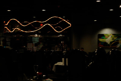
-There is a lighting feature at the front, behind the front desk. reception area
-The main source comes from a grid of recessed can lighting on the ceiling.
-The windows have been blocked out by screens. In other words, there is little to no natural daylight.
Observations:
-Thought the restaurant is meant to feel comfortable and intimate, it only really feels that way under certain conditions:
Lighting is fine for dinner. It evokes a quiet and peaceful atmosphere highly conducive to
leisurely eating in later hours.
Light does not exactly work for lunch. The darkness and quiet nature does not make one
want to go back to work to be productive.
Suggestions: Opening up the windows and doors to allow for more natural daylight.
Would make the space less dark and lethargic during the day.
-The lighting casts dramatic shadows in the space:
The space is painted with grey tones to enhance the effect. It produces deeper, more intense shadows
Recommendations for the Space:
-It can be challenging to see the people one is with, as well as the food.
-Maybe place floor lights or pendant lights near tables to further establish ambiance in the space.
Mood:
The mood, as said before, is very family and group oriented. That is to say, the space is very intimate.
Due to the dimness of the lighting, and subsequent darkness of the space, people are talking quietly amongst themselves.
People also keep to their tables.
There is very little exchange in eye contact or acknowledgment between other tables.
Grid, Recessed Lighting:
Retail Store:
Super Target
Durham, NC
Observations:
Summary:
-Target Super Center has everything in it; it really is all inclusive:
Food
Housewares
Clothing
Electronics
Etc, etc, etc
-Though there are various items sold at the store, the space and lighting stays the same.
No ceiling height changes
No lighting changes
-The store is a flexible shell
Its shell remains uniform throughout so that the contents can be reorganized and moved around whenever needed.
-The only area that has some variety in lighting is the produce and display areas
warmer lights are used to make the the food seem more appealing
-Private spaces are the only spaces were ceiling height changes are used.
ex. bathrooms
Recommendations:
-I would alter the lighting and level heights according to each category of the space
ex. Fitting rooms need to have different lighting. It would make the clothing look less harsh and dramatic. Possibly more appealing
-Add level changes to bring light closer to the products. It would feel less bright and cold in the space. If there was less direct glare, the indirect glare on the products may lessen, and they would end up looking more appealing to the customers.
Shadows:
-There are no windows in the space, except for the front doors
-Must rely on interior overhead lighting
-There is a need for more windows and closer lighting to make area warmer. It would cast moving shadows and give visual interest to certain areas of the space.
Activities:
-The store is massive
-The atmosphere: vibrant
People: Talk to their families/ friends. They navigate easily around each other even with the addition of bulky carts.
-The space has a lot going on with a lot of things to do. It is only fitting that there are various lights place to create moods and separation in the store. It would add a touch of personality and way-finding to an otherwise boxy, impersonal space.
Gallery/ Museum Space:
Student Showpiece Space
Elliot University Center
UNC Greensboro
Summary:
-The student gallery is a place were:
Students can display their work
Open to everybody
Located in a busy University community center
Rotates contents regularly
Small space
Most of the exhibit space is wall space
Characteristics:
Space has only one entrance/exit
One window that looks onto the hallway that connects the EUC to the Jackson Library.
No exterior windows or skylights, therefor no natural daylight coming into the space
Walls are all white
Moderately high ceilings
Lighting:
1. Recessed Rectangular Lighting
*ceiling is on a grid and the lights take up a component of the grid.
Produced direct glare and, in turn, indirect glare on some of the reflective material and glass exhibits
Task Lighting- used to light to space
2. Track Lighting
Each light is positioned and used to highlight individually displayed exhibits.
Produces semi-direct glare onto the surfaces, which reflect the light as indirect glare.
Considered Focal Lighting- to highlight the exhibits
-The lights are very successful in the space. It is clear that one is mean to light up the space, while the other type is meant to highlight and feature aspects of the space.
Shadows:
There are not many shadows since the space i so well lit.
There are shadows between the exhibits where light is not needed
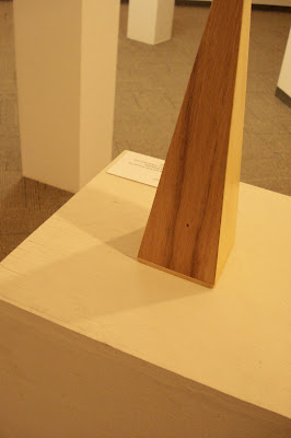
Shadows are also cast onto the exhibit pieces themselves, to add some drama and visual depth.
Recommendations:
I don't have many for the space
The spatial lighting functions really well for the alloted purposes.
Possibly add lighting at the entrance as to guide people in and establish some wayfinding.
Mood:
The mood is positive
It is informative and bright. It is easy to view and learn about each exhibit
It is also welcoming; the simplicity informs viewers of the respect level( it is a gallery after-all).


No comments:
Post a Comment